BRIEFING
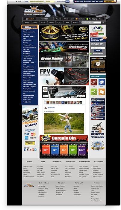
Current Website Statues
Distractive
Complicated
Unfriendly
Not responsive
Messy
Research & Strategy Deployment Results 120% Boost in Revenue Streams22X Increase in Conversion Rate
Complicated
Unfriendly
Not responsive
Much to our surprise, when we look at all of these negative things, we meet the ugly truth that this current website is considered as the leader of hobby stores on the internet.About one decade, this journey started and brought a huge and great success. Making any primary changes to this website would be a brave decision. Because anything could really affect this success! But the pain would be more if nothing changed. Because competition is too high right now.My role as a UX/UI Chief Strategist was to lead and inspire the team about the latest trends of creativity and design. Results will show how we brought innovative UX elements that can be adapted to any eCommerce website.
Process
Research and Analysis
Starting with multi-channels of research and analysis. I interviewed most of company’s stakeholders and got their feedback about current website for things that needs quick actions and things that need more work to do. In addition to get more insights about the vision of HobbyKing future, and how they see it.
We have created a rich competitive analysis for the Hobby market. We studied our direct and indirect competitors. We created SWOT analysis also competitors’ site features like payment solutions and unique elements of social engagement.
Heatmap analysis helped me a lot to understand more HobbyKing site pages. It provided me with insights about customer’s interests on each page. Were they click and if they scroll down to see all page content.
I interviewed most of the company’s stakeholders and got their feedback on the current website for things that need quick actions and things that need more work to do. In addition to getting more insights about the vision of HobbyKing future, and how they see it.
Fortunately, HobbyKing community is very loyal. And it’s easy to get so rich feedback that is really direct to pain. So many suggestions helped me to get the complete picture of what exactly I should do.
Heatmap analysis helped me a lot to understand more HobbyKing site pages. It provided me with insights about customer’s interests on each page. Were they click and if they scroll down to see all page content.
I used here also VWO tool to record customer’s activities on our site. That was really useful and helped me to find errors, bugs, and mistakes that were hidden and no way to find them without such a great tool.
Information Architecture
Persona
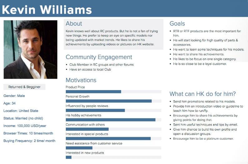
The More Advanced Personas You Create
The More Understanding For your Target Audience You Will Get

New to Hobby King & Market
Adam works hard every day and he usually reaches home around 7:00 pm. Mostly he practices his hobby on weekends. (He normally only works on his hobbies on the weekend) Sometimes he uses a search engine to do a small(some) research. He still does not have that much of knowledge about RC products. (he is not very knowledgeable about RC products.)

Returned & Beginner

New to Hobby King & Market
Adam works hard every day and he usually reaches home around 7:00 pm. Mostly he practices his hobby on weekends. (He normally only works on his hobbies on the weekend) Sometimes he uses a search engine to do a small(some) research. He still does not have that much of knowledge about RC products. (he is not very knowledgeable about RC products.)

Returned & Advanced
Survey
Design
Strategy
Mobile-First approach
I believe this technique is becoming a most and helps more to make things more simple.
Studying mobile eCommerce sites
I studied more than 50 worldwide e-commerce sites when I created wireframes. Best research website to look at is Baymard Institute.
High-Fidelity wireframes
It was more convenient in our situation to proceed directly in creating high fidelity wireframes
Designs
Research and Analysis
I have designed a lot of pages … I will pick the main ones, and if you want to see more, you can browse through HTML links provided into each design and discover more.
Homepage
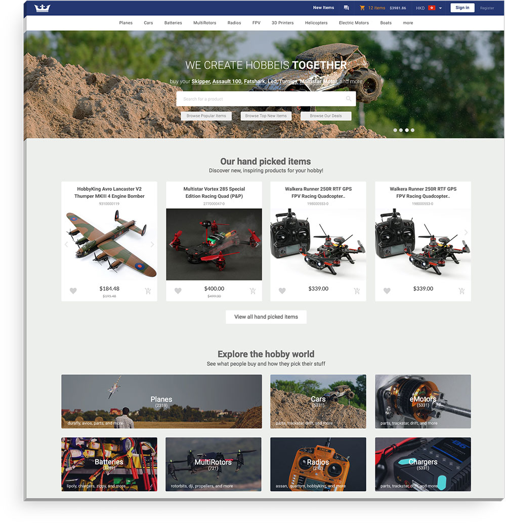
Our statistics tell that most of the homepage visitors are clicking on search area. That's why we found it more appealing to have a clear big search are in front of the homepage.In addition to that, we are going to show personalized items for customers based on their activities. And because some of the categories would be difficult to understand what inside, I added more visually appealing for each category. In addition to that, I have added the number of items inside and most popular tags been used within that category. Also, those categories can be changed for each customer based on his activity.
Category Landing Page
Category landing page is one of the most important pages on our site. The challenge was how to show all important elements within that specific category. For that reason, I have added more tags and call to actions that direct you clearly to what you are looking for.
Product Page
There are a lot of design strategies I can use here. And I found persuasive design strategy would be the best choice on HobbyKing case. The main reason is we already have a lot of community content that we can use on the page. I tried to show most of it in the hotspot area, and before even customer scroll down.
Brand Page
For SEO, we needed to have single pages for brands pages which contains different items in different categories. I tried to make it looks easy to navigate through different categories within a specific brand page. I hope what I did accomplished that. What do you think?
Products Listing Page
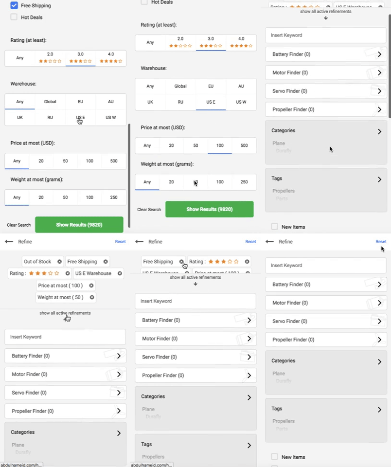
I tried to enhance our search and listing experience. One of the most important elements here were adding filtration on the left side.Another challenge was here is how to always show items even with those increased filters. And this was by adding those filters in a creative way like ``Price at most`` instead of having to point selections which would increase the ``no results found`` page.
Cart View
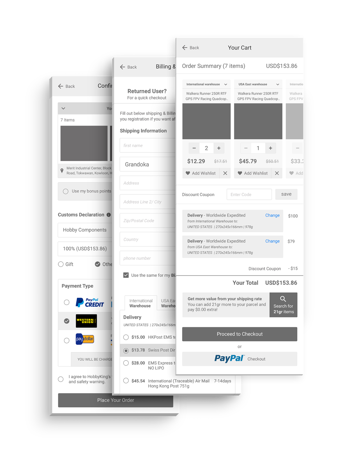
It took me too long time to study the best, easy, and fast checkout can be. I studied more than 50 eCommerce sites to come up with the result I am providing here. It's all starts with cart page, and how you can let the customer enter the funnel easily and without any difficulties appear.I wanted to keep showing CTA with all it's affected prices in the right side. And all items can be scrolled in the left side. Also having the ``add more from wishlist`` at the top to increase basket value.
Features
Add to Cart Flouting Button
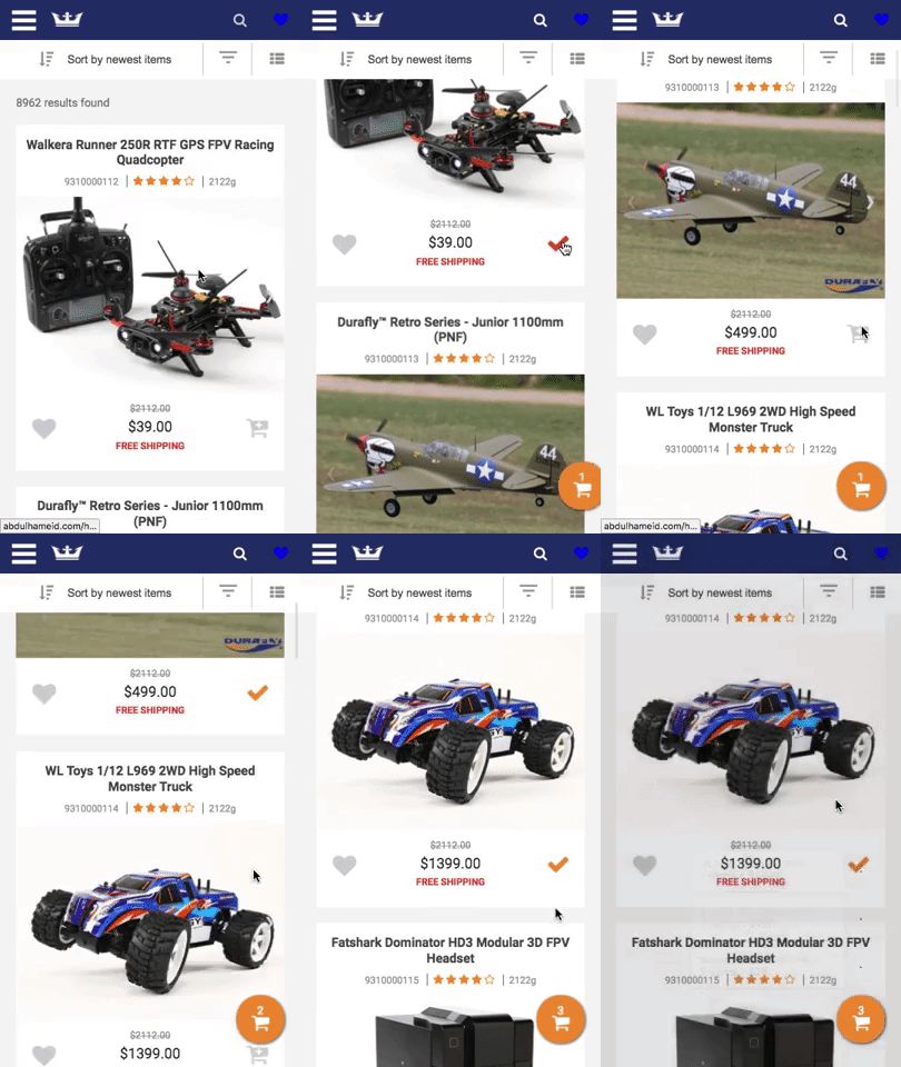
Material design from Google is one of the strongest design trends ever made in regards to usability and ease of use. An important element is a floating button, and I wanted to use in eCommerce in a way that reflects usability and ease of use. I found using it in adding items to cart will be very useful and would bring more interaction with user’s basket. I worked closely with development team to come up with a great solution that can enhance the user experience in adding items to cart.
Filtration
Emails

Price War!
This email is for our discount campaigns we launch each year.
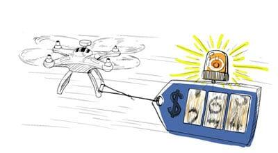
Product Price Alert
We send alert email for those who choose to get alert for price update on specific item.
Store Credit
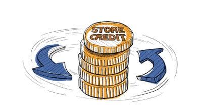
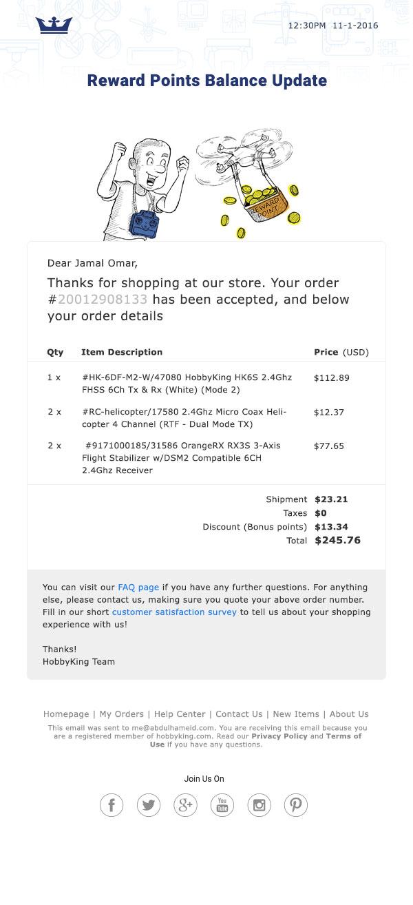
We send email update for any change on our customer’s store credit.
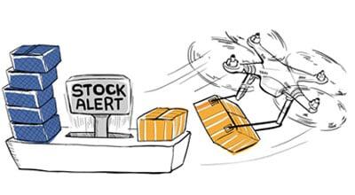
Stock Availability Alert
For all those out of stock items, our customers can set an alert to get update when it’s available again.
Information Architecture
Each customer will enjoy a unique experience on almost every page
Each customer will enjoy a unique experience on almost every page
Marketing
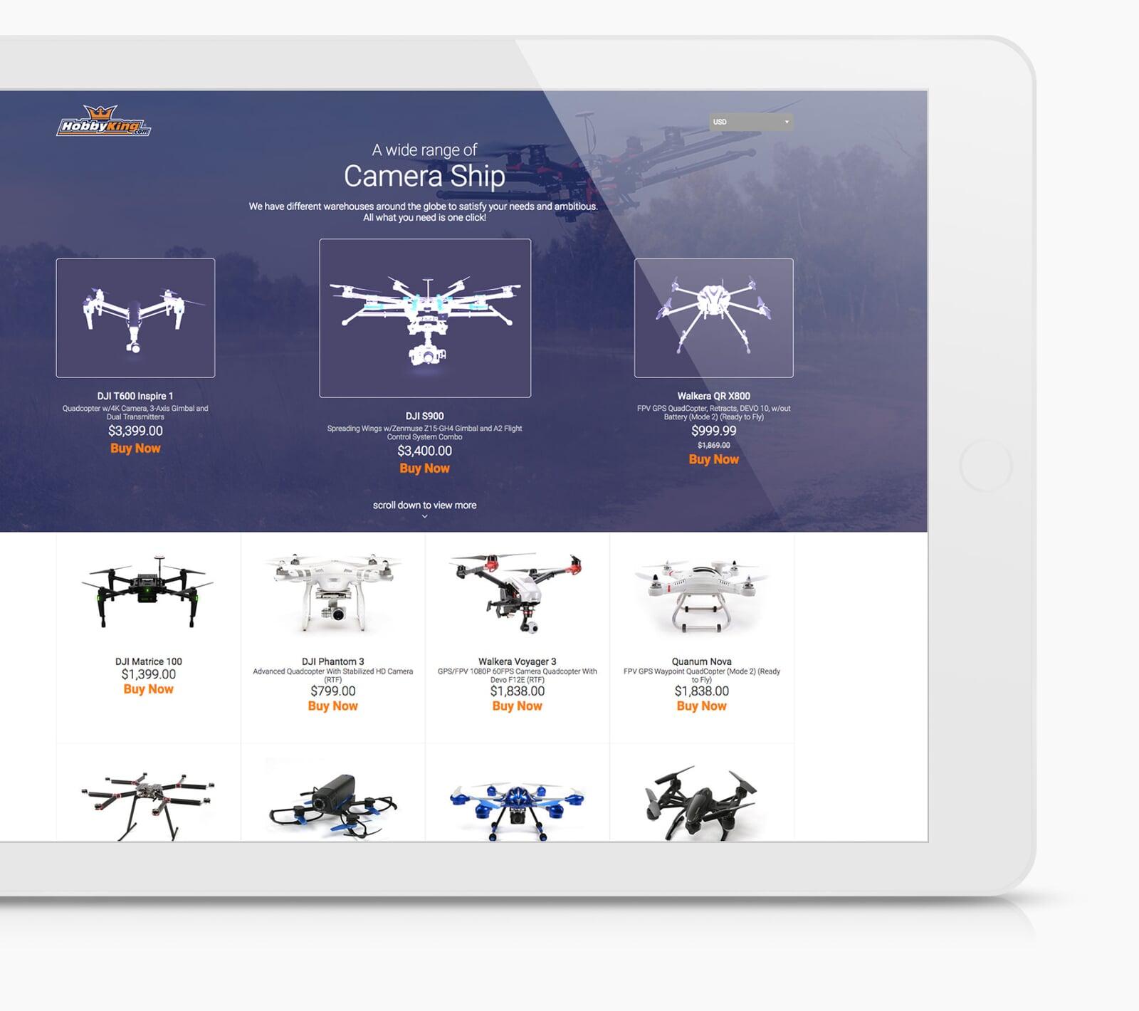
We Are Ready When You Are.
Have a project in mind? At Innoruptions; your trusted advisor, we are ready to disrupt.
Eng. Abdulhameid Grandoka
UX/UI Chief Strategist
